
 You know what's more entertaining than good videogame box art? Bad videogame box art. I decided to track down ten of my favorite terrible pieces of "art" and put them in a single (or double) post. You're welcome. Following are the first five in the collection.
Most of these serve as a sort of “history of bad,” bridging the decades and multiple consoles, yet united by a common sucktitude.
Don't forget to click on the image to see a larger, more gloriously terrible version.
Mega Man 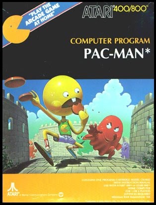
The cover for the original Mega Man on the NES is probably the most famous examples of terrible videogame boxart. The proportions are all wrong. There's no perspective. The guy doesn't even look like Mega Man. I want to know who looked at this and said “Yes! This is perfect! It really captures the essence of the game.” For such a good early platformer, this artwork is god-awful. Can anyone tell me what those yellow things are? And why (oh why) does his head fit in the helmet like that?
Pac-Man
This is just hilarious to me. It's like someone in marketing looked at Pac-Man being played and was like “How's that yellow head-thing moving around and what are those yellow things he's eating?” When nobody had  a good answer, he pulled in the artist and said “You give this guy legs and make those yellow things cookies. Otherwise, kid's aren't going to understand what they're seeing and, by God, I'm going to make this game make sense.”
Safecracker
If the name of this game didn't get your heart pumping with anticipation, maybe this sweet, sweet boxart will. Is it possible to come up with something more dull than this? I should probably mention that this box won out over about a million similarly terribly arted (is that even a word?) Wii and DS games. Shovelware breeds horendous boxart and those systems hold the record for most craptastic games. Safecracker was picked  because I truly believe a special effort has to be made to do anything this half-assed.
Tommy Lasorda Baseball
This one I just find terrifying. It's like an early example of really, really bad Photoshoping before such technology even existed. How is it even possible to make a face look that creepy? Sure, the guy used to pitch. But at the time this game came out, and about thirty years before it, he was no longer actually playing the game. Were there no big-name players to put on the box in an action pose?
Fester's Quest 
Once again, I can't help but wonder who they were trying to sell this game to. When I was a kid, this boxart scared the crap out of me. Now, well...It scares the crap out of me. Between this and Lasorda, I have enough nightmare material to last a few weeks. Ignoring the terror aspect, who would look at this box and think “I just gots to play this game?”
Thursday, July 29, 2010
Top ten worst video game box art: Part one
![]()
Subscribe to:
Post Comments (Atom)


No comments:
Post a Comment